Houzz · 2021
A platform where home professionals showcase their work, build credibility, and get hired.

Process
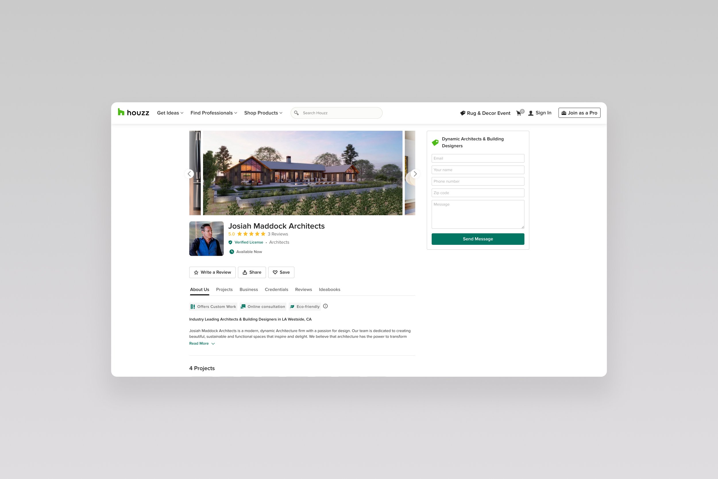
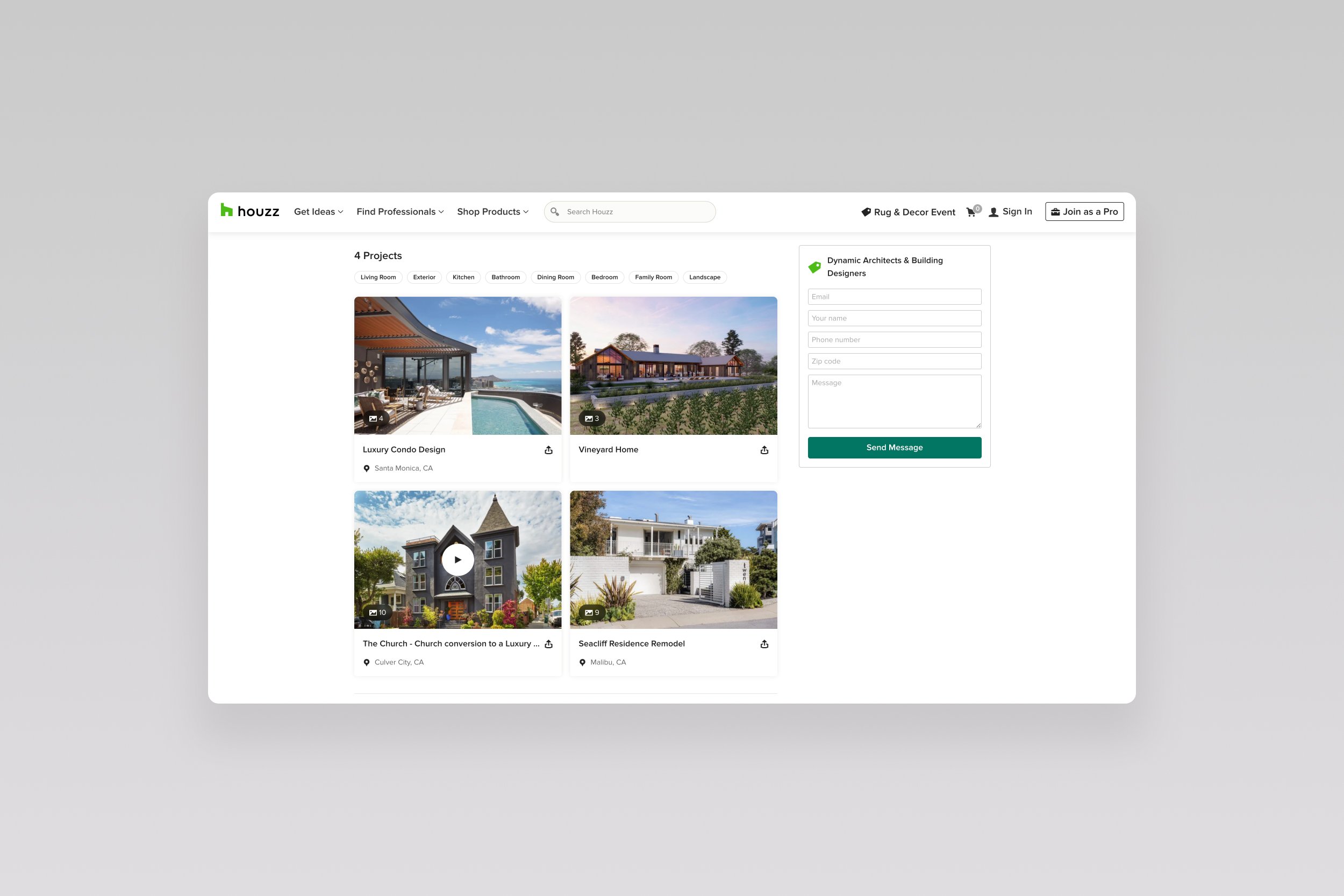
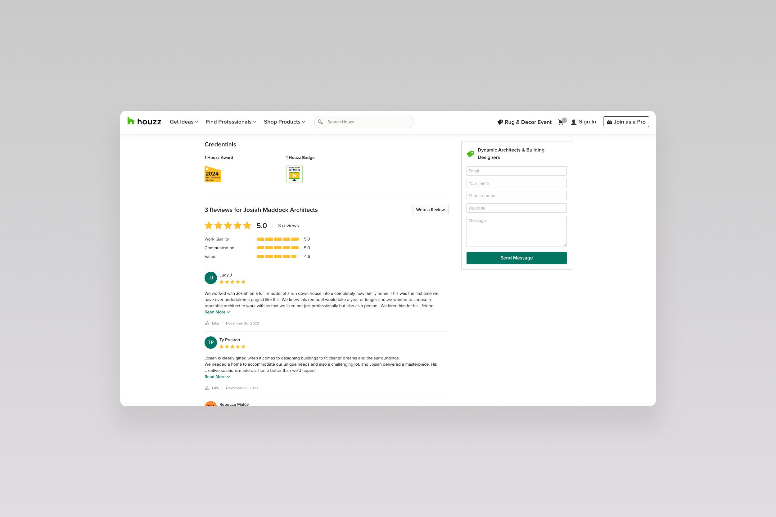
The Houzz Pro profile is the designated space on Houzz where professionals can showcase their work portfolios, achievements, certifications, and reviews. It serves as a marketing platform for professionals to promote their businesses and attract potential clients. Around 57% of Houzz desktop users use low-res screens (1280px). Therefore, a significant portion of the profile-converting info (portfolio, reviews) gets lost below the fold in the homeowner browsing experience. 12.4% of our users will mostly not scroll below the fold.
The old pro profile was built with 3 rails of content, which created a condensed and “bulky” content organization, bad responsiveness, and complexity when scanning the profile at a glance.
Background
Goals
Quality connections: Drive more quality connections within the profile. Homeowners will likely click the “Contact” button more often and find this pro suitable for their remodeling project (strong connection). Reduce the Homeowner bounce rate when exploring different pros in their remodeling journey.
Responsiveness: Ensure the redesign works at large screen resolutions.
Promoting relevant content: Promote the most pertinent content to homeowners, such as project photos and reviews, and make it more detailed (review aspects).
Tracking metrics
To assess the effectiveness of the layout reorganization, we decided on the following KPIs: Time on site, number of clicks on "Contact Pros," and quality connections — indicating whether the user marked these leads as quality leads.Responsiveness: Ensure the redesign works at large screen resolutions.
Interviewees: 10 different pros from similar categories. i.e., design-build firms, remodelers, general contractors. All considered power users: Uploaded more than 5 projects, completed profile info and had at least one review.
Research
Card sorting exercise: Each of the 10 interviewees was asked to drag & drop the most important information their profile should promote from “most important to “nice to have.” They can also add custom information by using the blank card. By adding these exercises into the interview, we understood which areas are most important to the users, and we should put more focus on them.
Wireframes
Based on the feedback from research, we tested a few design layouts for the profile with participants, choosing the one that worked best in terms of hierarchy and content organization.

Soft Launch AB Testing
We decided to conduct an AB test for 10% of US users over 90 days, during which we defined the following key metrics as KPIs: Time on site, number of clicks on "Contact Pros," and quality connections. We observed significant improvements in quality connections and time on site indicators. Therefore, we decided to roll out the redesign globally to 100% of users.
-
+2.0% contact pros indicated
Compared to the control group
-
+5.0% quality connections
Compared to the control group